Have you ever wondered how colors affect our emotions and shape our experiences?
Colors were crucial in shaping our emotions and perceptions of certain sign boards.
For instance, red is often associated with danger or stop, and green means positive or a go-ahead light.
Moreover, colors shape emotions. We feel happy after seeing the sunset with the yellow shades and the blue skies.
So yes, colors do shape our emotions and moods to a great extent.
This article will explore colors that grab people’s attention the most.
The Basics of Color Psychology
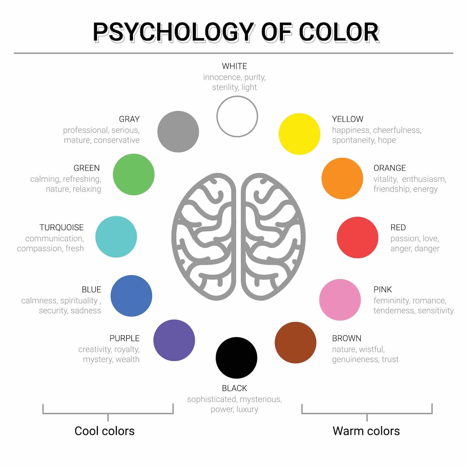
Color psychology studies how colors impact our human emotions, behavior, and perceptions in different walks of life.
To a great extent, colors also impact our decision-making progress. This happens on a very subconscious level; that’s why we are never able to notice this.
For instance, warm colors, such as reds, oranges, and yellows, are known for their energetic and passionate light.
That’s why lamps usually have warmer lights. On the other hand, red can convey urgency or intensity, while yellow radiates positivity and optimism.
Conversely, cool colors like blues and greens are more calming and soothing.
Blue, in particular, is often linked with trust, reliability, and professionalism.
This is why these colors are used in corporate settings to establish a sense of stability and credibility.
Its important for you to understand the basics of color psychology because it will allow you to use colors to communicate specific messages strategically.
Most Attention-Grabbing Colors
1. Red
Red as a color commands focus and seem bold and vibrant with its presence.
It also signals urgency, passion, and intensity. Red is the most attention-grabbing color, making it an easy choice for ambulances, firetrucks, and all other emergency vehicle services.
Also, think about the stop sign and light on a traffic signal; they all are in red because of easy visibility and the attention that the red color commands from the viewers.
Red is also widely used in branding and advertising.
For instance, logos of renowned brands like Coca-Cola, Target, and Netflix have red in their icon to dominate their presence in the consumer’s mind.
2. Yellow
Yellow feels like sunshine and carries optimism, which is enough to uplift the mood.
For insurance, a sunflower fills anybody’s heart with positivity and happiness.
In design and marketing, yellow is a go-to choice for its ability to convey energy and positivity.
For instance, yellow is used in emojis or smiley faces, and yellow is often seen in hoardings of different shops and menus of famous restaurants.
What makes yellow truly special is its versatility; it easily adapts to its surroundings.
It’s a color that doesn’t just demand attention but also brings a smile to your face.
3. Orange
Orange holds the perfect balance of warmth and energy. This is because it is rightly positioned between red and yellow.
The color orange also always manages to capture the attention without overpowering the other shades.
Orange symbolizes enthusiasm and creativity, making it an excellent choice for brands and designs that convey friendliness and innovation.
Orange color radiates warmth, as you might have often seen in fireplaces, not just the head, but also the color helps create a welcoming and approachable atmosphere.
4. Blue
Blue holds a unique place in all of the color spectrum. Blue generally has a calming influence on our minds, especially the lighter shades.
For instance, look at the ocean, the beaches, and the sky; they are all blue, making you feel calmer each moment.
In the corporate world, blue symbolizes trust, reliability, and professionalism.
It’s not a coincidence that many financial institutions, social media platforms, and tech giants incorporate shades of blue into their branding.
Blue is a go-to color for businesses aiming to establish credibility. Moreover, blue also carries a therapeutic quality.
Some studies suggest that exposure to the color blue can lower heart rates, which is a very interesting observation.
5. Green
Green is often associated with lush landscapes and plants that surround us. It also symbolizes growth, health, and peace.
This color connects humans to nature.
From the leaves on trees to the grass under our feet, green reminds us of the beauty and balance found in nature.
In the corporate world, advertisers and marketers use this connection of green to nature to promote eco-friendly products, sustainable practices, and a healthy lifestyle.
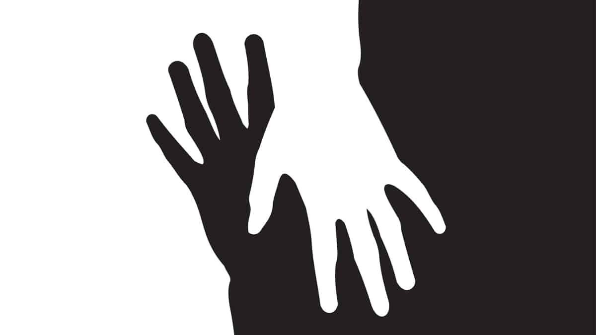
Contrast Matters: Black, White, and Beyond
Even though all the above colors are attention-grabbing, you just saw how you can use colors to grab people’s attention towards different things.
But do remember that using one color might not always be that impactful. This is why contrast matters.
For instance, the evergreen, black and white, the timeless duo, is often used to portray opposition.
Black acts as the background where all the colors are highlighted.
It is elegant, making it a go-to fashion, branding, and design choice. In the world of typography, black color commands attention with its bold statements and provides clarity.
Beyond the classic black-and-white interplay, high-contrast color combinations, such as complementary or triadic schemes, where high-contrast colors are matched together in a way that, instead of overpowering, should complement each other.
Interested in learning more? Check out our previous blog, where we’ve covered the intricacies of colorful painting ideas.
Use the above knowledge to customize your message per the intended target audience.
Conclusion
It’s fascinating how colors silently affect our daily experiences, shape our decisions, and influence our lives.
Whether reds or blues, each color plays a unique role in the art and grabs attention.
Understanding the psychology behind colors is important because it allows us to use the right color for the right kind of message and communication with our audiences.
Colors are that extra tool that empowers us to communicate more effectively.
Whether designing a logo, creating marketing materials, or simply expressing ourselves, colors help subtly but impactfully.
Frequently Asked Questions
Why Is Red Often Used in Emergency Services and Branding?
Red is attention-grabbing and signifies urgency and passion. In emergency services, its visibility is crucial.
Branding helps create a bold and vibrant presence, as seen in logos like Coca-Cola.
Red’s psychological impact makes it an effective safety and brand recognition choice.
Why Is Contrast Important in Color Selection?
The contrast in color selection is crucial for visual impact.
It ensures clarity, making colors stand out and preventing visual fatigue and boredom.
Using a single color for a complicated design or logo will make everything look haphazard and untidy.
How Does Green Connect with Nature and Influence Marketing?
Green is inherently tied to nature. In marketing, green is strategically used to promote eco-friendly products, sustainable practices, and a healthy lifestyle.
Its presence in branding and marketing gives out the message of environmental consciousness, making it a powerful tool for businesses aiming to appeal to eco-conscious audiences.