Colors play an important role in our lives as they influence our decisions. Every sellable article deals with visually aesthetic colors, from clothes to books and furniture.
The right color can also shift our perception and influence our behavior. So, there is no denying that the right color palate can create a huge difference for brands.
Psychologists have proven the profound effect colors have on humans. So, it is no wonder that brands curate their products with this theory, hoping for high sales.
Even the most artistic and colorful painting ideas depend on color theory to become successful. In this article, we talk about influential colors and how choosing the right one is important.
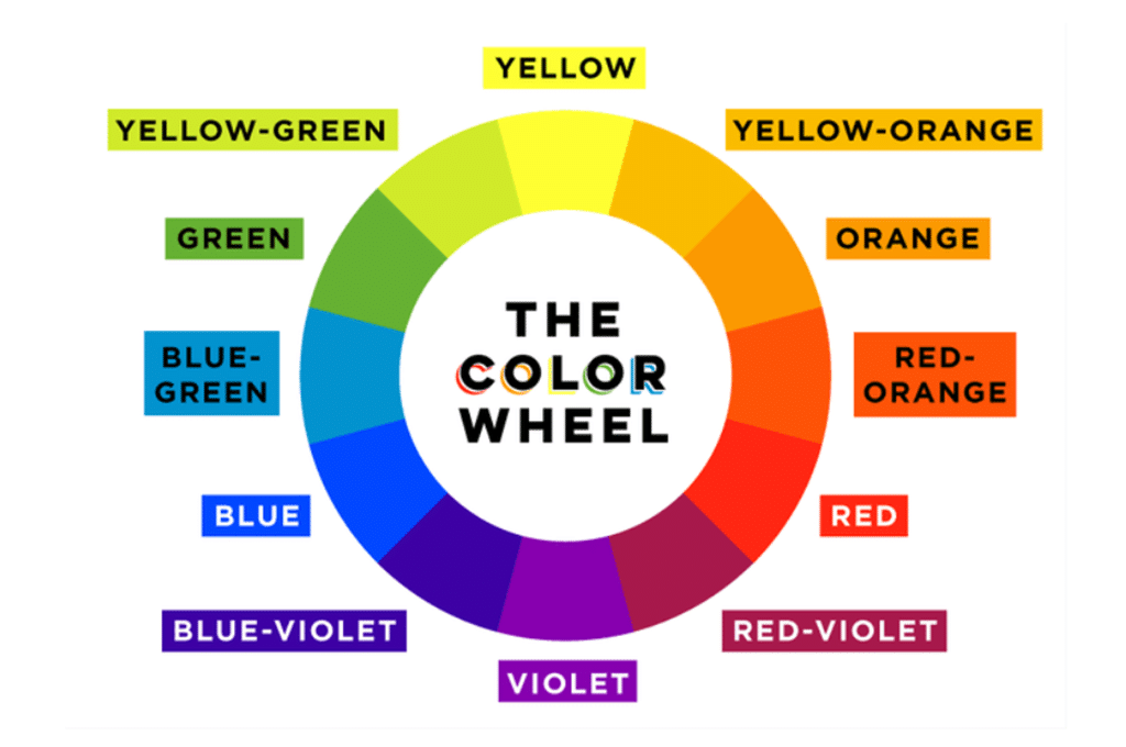
The Importance Of Choosing The Right Color
The process of choosing the right colors is complicated. But the first step is to know what the customers like.
No one color will successfully bring your business more attention. So, choosing from a mixture of colors that align with the company’s image is better.
The three components of color, hue, chroma, and value are also considered. However, value and chroma affect perception much more than hue regarding consumer appeal.
Here are the top colors that are known to be influential for businesses.
1. Red
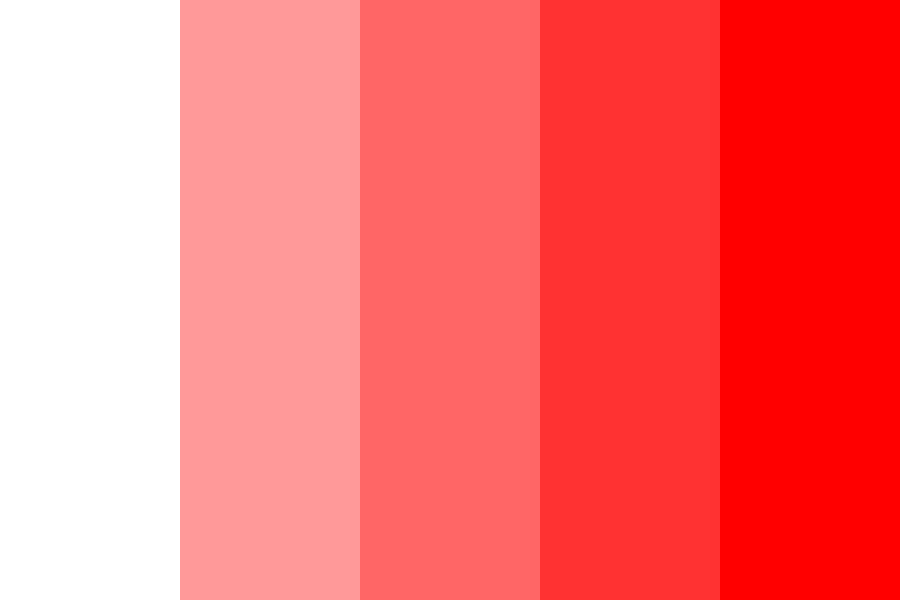
Red has been the most popular color used in marketing for a long while. It symbolizes power and action, making it hard to ignore.
We feel a sense of urgency and an increased heart rate when we think of red. The color has a lot of potential when used for businesses.
When a company’s red logo is sure to make prospective buyers look twice. Red is also used in trigger advertisements to amplify your need to buy.
The color often denotes a sale in outlet malls and stores.
2. Blue

Blue has the best appeal if you are looking for something more relaxing. It is softer than darker shades like black, giving off a sense of security.
Blue in a company’s website or logo usually inspires trust. One of the most popular places where blue is used is for healthcare.
It makes the patient think they’re safe and in good hands. Apart from that, many stores use blue in their palate to give customers an anxiety-free buying experience.
3. Orange

Among the colors of VIBGYOR, orange is a shade that is bound to make the customers feel good. It is a bright and energetic shade associated with autumn and change.
Orange also has an earthy connection due to the fruit. With an orange palate, your customers are reminded of life and vitality.
Orange is a warm color but invites trust more than immediate attention. The color is active but also friendly.
The freshness of the color makes it suitable for most industries.
4. Green
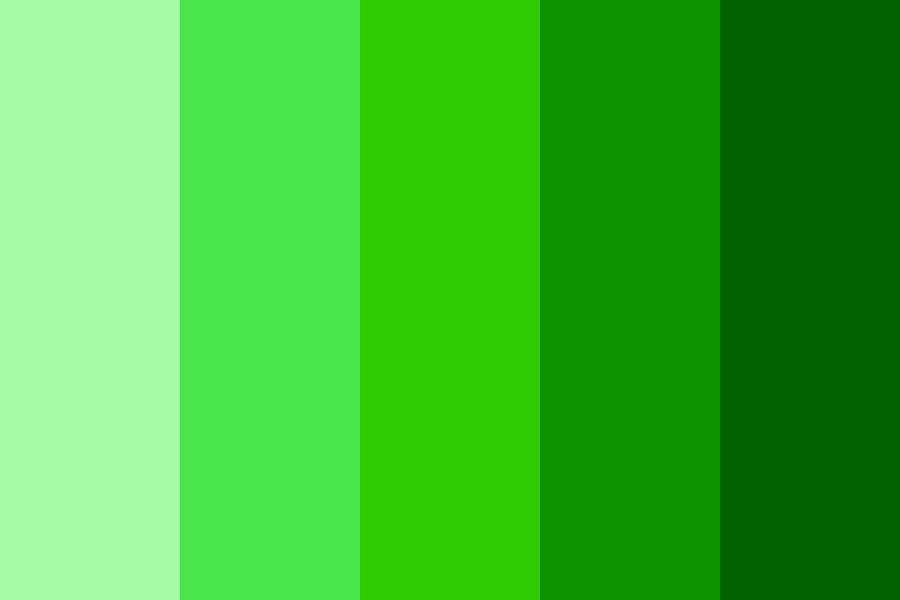
Green is often used to make the customers feel at home. The first vividly green idea we can think of is the traffic lights, which indicate a safe time to cross.
Similarly, the hue is used to get customers to take action in a leisurely manner. The warm and inviting nature of green inspires the buyers to go for it.
It is also often connected with the environment, a fact many industries exploit despite no direct connection. The outdoorsy connotation of green also invites creativity in people.
5. Purple
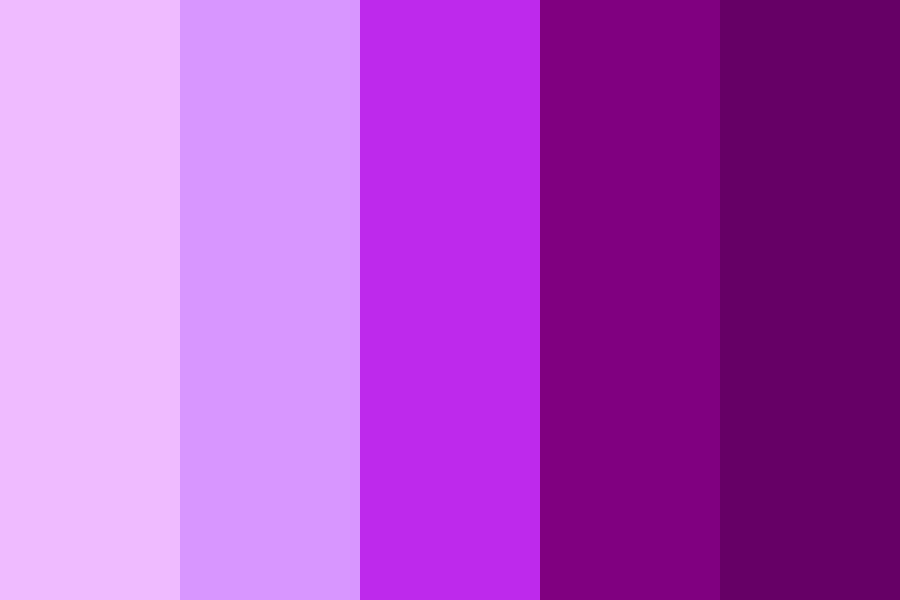
Purple is not among the primary colors of the spectrum, but there can be no doubt of its potency.
The mixture of red and blue carries the signature properties of both. It often symbolizes royalty and power, inspiring spirituality and creative essence in people.
A color as vivid as purple is often suited for the more luxurious and wealthy of brands. It embodies elegance while giving a hint of romance.
Purple is also used for audiences, mainly women, narrowing its usage slightly.
6. Pink

One of the most noticeable colors to use on a campaign is pink. It has always been associated with femininity, but it adds charm and tenderness to the image.
Using the right shade of pink can give a relaxing vibe to the enterprise. Pink is a bright and attractive color that grabs attention with excitement.
It is mostly used in the beauty industry to promote romance and harmony. But the color has also helped many industries break the mold.
7. Black/White
Black and white are on opposite sides of the spectrum, so they pair beautifully. But even by themselves, they have their unique appeal.
Black is considered a powerful tool in business, promoting a life of simple luxury. Even when used sparingly, it can make quite an impact.
On the other hand, white symbolizes purity and innocence. It works ideally in the background but is useful for minimalistic designs.
White is also used in the healthcare sector along with luxury items.
Summing It Up
Colors are an important part of a brand’s image as it can transform the customer’s mindset. It influences people subtly but with a potency that changes their minds in a minute.
With the right colors, you can create a positive impact on sales. However, it is important to consider the best shades and how they look against the brand’s motto.
Red is one of the most popular colors used worldwide for optimum effect. But even colors like pink and purple can leave their mark. Black is essential for every minimalist design.
So, let us know your favorite colors and how they make you feel in the comments below!