Among the many elements that influence the mood and narrative of an image, color is one of the most significant parts of every photographer’s toolkit. Using warm hues like orange, yellow, and red can ignite feelings of love, passion, joy, and energy.
These shades grab the viewers’ attention immediately. Whether capturing the golden hour’s soft glow or the vibrancy of a bustling city street, understanding how to use warm tones effectively can redefine your visual narrative.
This article explores the importance of tone in photography, focusing on warm shades. It explains how to enhance these tones during the editing process and provides practical tips for creating attention-grabbing and emotionally appealing photos.
Understanding Warm Color Photography
Why is color important in photography? Color is a powerful tool for conveying mood, emotion, and narrative. It directs the viewer’s attention and highlights key aspects of a scene.
It defines visual perception on both emotional and aesthetic levels. The properly chosen palette sets the picture’s tone. That is why learning to manipulate shades and hues is crucial for photographers.
Warm colors are traditionally associated with comfort and coziness when muted and passion and dynamism when bright.
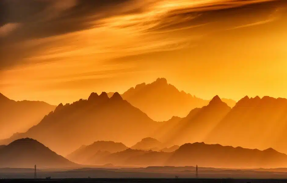
A properly selected tonal range can make your images more inviting or intense, depending on your creative goals. For example, a sunset bathed in golden hues can evoke calm and nostalgia, while a vibrant red street scene can suggest joy and delight.
Warm colors are actively used to highlight the subject and evoke a specific emotional response. In portrait photography, warm tones can enhance skin tones. The model looks more vibrant and alive. Warm shades in portraits convey closeness and comfort.
Reds, yellows, and oranges can also effectively enhance visual storytelling. Whether capturing the cozy atmosphere of a café or the fiery energy of a festival, these tones add depth and context to the narrative, making the viewers feel connected with the story.
Using warm hues in culinary photography can make the viewers’ mouths water. For instance, imagine capturing a freshly baked loaf of bread on a wooden table. Emphasize the bread’s golden crust and the rich earthy hues of the table. This approach will emphasize the colors and textures of culinary masterpieces. From an emotional point of view, this image will evoke feelings of home and comfort.
How to Use Color in Photography: Editing Techniques
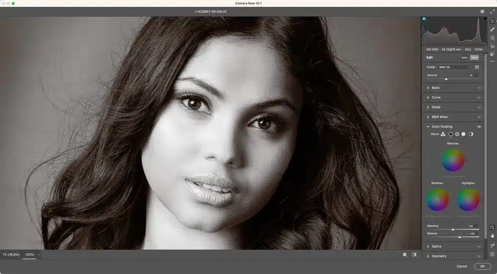
Basic Modifications
Once the photo editor is chosen and installed, upload the image you want to work on and start the adjustments. Begin with color tones. Increase the saturation and vibrancy of warm hues. Shift the white balance slightly to the warm end of the spectrum. Enhance the reds, oranges, and yellows for a more inviting mood.
Adjust the contrast to ensure that the shadows and highlights are well-balanced. Preserve the warmth and highlight the important details. Contrasts are pivotal for adding depth and richness to your shots. The lack of contrast makes your photo look flat and uninteresting. Be cautious; an overly contrasted picture looks harsh and unnatural. Balance is the key here.
Presets
To instantly enhance the warm tones in your pics, ensure your photo editing program includes a sufficient amount of presets. For instance, the library of presets for Lightroom is immense. These are pre-designed settings developed by professional photographers for various creative goals.
If you have specific photographic needs, you can customize the presets accordingly. This feature is especially convenient for achieving a cohesive look across multiple images.
Once a preset is applied, further customization can help fine-tune the image. For example, adjusting the hue, saturation, and luminance (HSL) sliders can refine the warmth in specific color ranges. Ensure the final result looks natural.
Special Effects
Split toning allows you to add different colors to an image’s highlights and shadows. Use it to intensify the overall warmth. For instance, adding a golden tone to the highlights while keeping the shadows neutral can imitate the beautiful warm glow of golden hours if the initial lighting conditions let you down.
Color grading lets you adjust the overall color palette. The warm hues can be emphasized without ruining the general balance. Maintain a consistent look. This technique is particularly helpful for creating a specific atmosphere or mood.
Experiment with selective color adjustments. Boost the saturation of yellows and oranges in a landscape photo while reducing the blues and greens. It will attract your audience’s attention to the warm areas. Let’s take a forest landscape in the fall. Selectively enhancing the golden leaves while muting the background can create a striking contrast. This approach emphasizes the warmth and richness of the golden season.
Conclusion
By understanding the role of warm color photography and mastering the techniques to enhance these tones, you can turn ordinary photos into captivating visual stories. Whether adjusting the tone in photography to bring out the richness of a landscape or using presets for a cohesive look, the properly chosen palette will make your work stand out. Keep exploring, adjusting, and perfecting your use of color. Watch as your photography reaches new levels of depth and impact.