Choosing the right colours for your home can make all the difference in creating a space that is fresh, inviting, and on-trend. This year, interior design is about embracing nature, adding warmth, and incorporating bold, unexpected elements.
From calming greens to rich, earthy tones, the latest colour trends offer something for every style and taste. This year’s colour trends offer a variety of ways to refresh your living spaces and infuse them with style and character.
Embracing Nature-Inspired Greens
Nature-inspired greens are a standout trend in 2024. These shades, ranging from soft sage to deep forest green, evoke a sense of calm and balance, making them ideal for creating a peaceful retreat within your living spaces. The soothing qualities of these greens make them particularly well-suited for living rooms or bedrooms, where relaxation is key.
Incorporating these greens into your home can be simple yet impactful. A bold forest green accent wall instantly transforms a room into a serene oasis. If you prefer a more subtle approach, softer shades like sage or olive green can be introduced through furniture, such as a plush sofa or armchair, or through decorative elements like throw pillows, curtains, or area rugs. These greens pair beautifully with natural wood tones creating a harmonious, calming ambience.
Layering different shades of green throughout the room to add depth and interest, from pale minty tones in decorative accessories to darker hues in larger pieces. Incorporating greenery, such as potted flowers or botanical prints, can further amplify the natural feel, seamlessly tying the colour scheme together.
Brightening Spaces With Soft, Subtle Shades
Warm linens, whites, and neutral beige shades remain a staple in interior design, celebrated for their timeless appeal and versatility. These colours create a soft, inviting atmosphere that never goes out of style, making them a perfect choice for any home. Their subtle tones bring comfort, making spaces feel more open and welcoming.
Incorporating these shades into your home can be achieved in various ways. Consider a soft beige or linen white for walls to create a neutral canvas that brightens the room. In the kitchen, these tones work beautifully on cabinetry and countertops, providing a clean, fresh look that pairs well with a variety of materials, from marble to wood. You can also introduce these shades through textiles, such as linen curtains, cushions, or upholstered furniture, which add texture and depth while maintaining a serene palette.
In dining areas, a creamy, off-white tablecloth can create an elegant yet understated setting, while neutral-toned rugs anchor the space without overwhelming it. These colours also serve as an excellent backdrop for accent pieces, allowing you to easily incorporate bolder hues or patterns in your decor.
Vibrant artwork, colourful dishware, or seasonal decor, will complement the neutrality of the room. If you want an eye-catching piece to act as the focal point of your space, visit the goat wall art for elegant, modern designs that pair beautifully with minimalist and neutral dining decor.
Rustic Charm With Dark Earthy Tones
Dark, earthy tones have become increasingly popular in 2024, offering a grounding and cosy effect that adds depth to any space. Colours like deep browns, charcoal greys, and rich terracotta bring a sense of warmth and stability, making them ideal for creating intimate, inviting environments. These tones are particularly effective in adding a touch of character to often overlooked areas, such as garages.
Incorporating such dark tones into a garage can transform it from a purely functional space into one that feels like an integral part of the home. One practical and stylish way to do this is using garage floor paint in shades like slate grey or chocolate brown. These colours not only hide dirt and wear effectively but also provide a sleek look that elevates the overall aesthetic of the garage.
Beyond the floor, these tones can be extended to the walls or cabinets, creating a cohesive design. Adding complementary elements, such as wooden storage units or metal shelving in darker finishes, can enhance the earthy, grounded feel. By integrating dark, earthy tones, your garage can become a well-designed extension of your home, offering both practicality and style.
Balancing Bold Blue With Neutral Elements
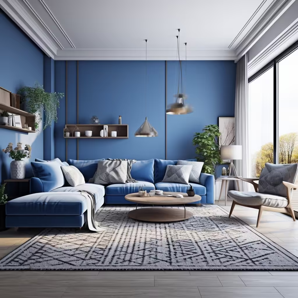
Reimagined blue is making waves in interior design, bringing a fresh, calming presence into any room. This year, incorporating a single blue element into a space is gaining popularity, as it effortlessly revitalises and enhances the overall aesthetic. Whether it’s vibrant cobalt, deep navy, or soft powder blue, these shades can add sophistication and tranquillity to your home.
To embrace this trend, consider introducing a blue accent wall in a bedroom or living room. A bold blue can serve as a stunning focal point, creating depth and visual interest. On the other hand, for a more understated approach, you might opt for blue furniture pieces, such as a sofa or armchair, which can instantly uplift the room’s mood. Smaller touches, like blue throw pillows, artwork, or vases, can make a significant impact without overwhelming the space.
One of the strengths of incorporating blue tones is its versatility. It pairs beautifully with warm and cool tones, allowing you to mix and match with existing decor. For instance, a deep navy works well with gold or brass accents for a luxurious look, while lighter blues can be paired with whites and natural textures for a coastal vibe.
Rich Red Tones For A Luxurious Dining Room
Venetian red is a bold and luxurious colour that exudes a sense of opulence, making it a striking choice for those looking to make a statement in their home. This deep, rich hue brings warmth and intensity to any space, whether used as a dominant or accent colour.
One of the best places to incorporate a rich red is in a dining room or home office, where its vibrant energy can create a refined ambience. In a dining room, consider using Venetian red on an accent wall to create a focal point that draws the eye. Paired with dark wood furniture and gold accents, the colour enhances a sense of luxury, making the space feel inviting and impressive.
In a home office, Venetian red can inspire creativity and focus, providing an energising and stylish backdrop. To balance the intensity of the colour, it’s important to pair it with neutral tones such as soft whites, beiges, or light greys. This combination helps to calm the boldness of the red, ensuring that the space remains visually harmonious and not overwhelming.