A guide for crafting a monochromatic interior: the fundamental principles of monochrome and practical ideas to revamp your space without breaking the bank. Learn how to integrate mismatched furniture with slipcovers for recliners or breathe new life into an old closet with a fresh coat of paint. Let’s embark on a journey to unlock the secrets of monochrome design, where a single color palette becomes the canvas for creating a harmonious and visually captivating living space.
The Power of Monochrome
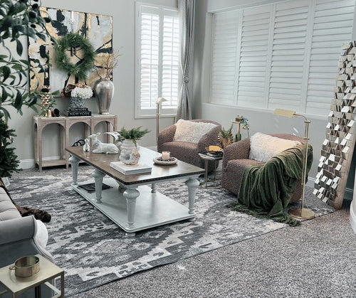
The monochromatic design relies on the use of variations in saturation and lightness of a single color. A streamlined approach creates a sense of unity and harmony throughout the space. The absence of contrasting colors allows for a tranquil and balanced ambiance, making it an ideal choice for various rooms in your home.
Here are the rules that will help you create an exciting and not overloaded monochrome color scheme in the interior:
- Thoughtful Palette: Curate a well-thought-out color palette by considering the undertones and harmonious blends, ensuring a visually balanced composition that resonates with each space’s desired ambiance and purpose.
- Tonal Variations: Play with various shades within the chosen color spectrum, experimenting with light and dark tones. This technique creates depth, dimension, and visual interest, preventing monotony in the design.
- Texture Exploration: Elevate the monochromatic scheme by introducing diverse textures. Smooth surfaces provide a sleek touch, rough textures add character, while fluffy elements infuse coziness, collectively enhancing the sensory experience of the space.
- Minimalistic Sophistication: Embrace minimalism by decluttering and focusing on essential elements, fostering an elegant and uncluttered aesthetic that exudes sophistication and tranquility.
Incorporating these elements ensures your monochromatic interior remains visually engaging without overwhelming the senses. Discover the allure of a well-thought-out monochrome palette, where simplicity meets sophistication in perfect harmony.
Creating Depth and Dimension
Contrary to the misconception that monochrome equals monotony, skilled use of shades and tints can add depth and dimension to the design. Incorporating lighter and darker tones and different textures creates visual attraction and prevents the space from feeling flat.
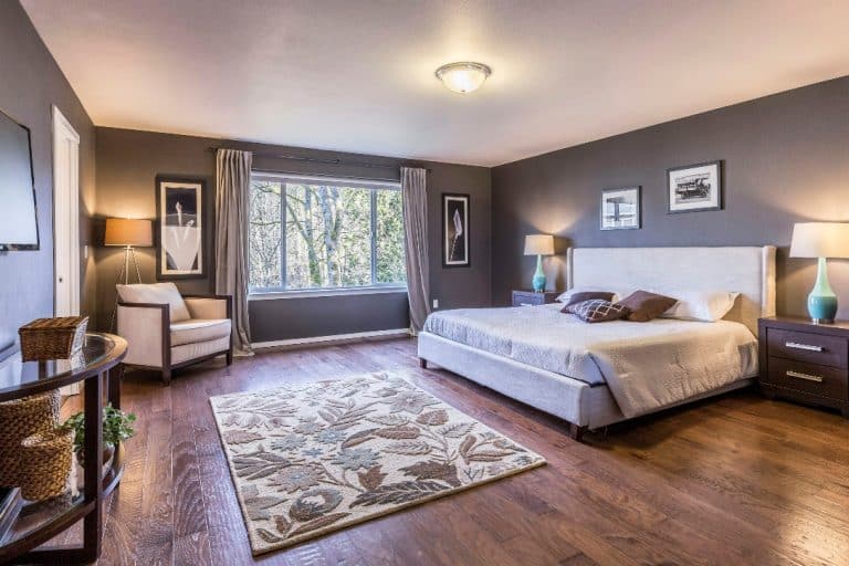
Varying values of the chosen color strategically contribute to a layered and visually dynamic space. For example, you can make one of the walls medium-dark and replicate that color in a lighter version in the rug or slipcover for the sofa. This focal point draws attention and introduces a subtle variation, preventing the space from becoming overly uniform.
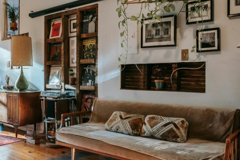
Textures play an essential role in enhancing the perceived depth. The introduction of various textures prevents the environment from feeling flat and monotonous. Consider incorporating diverse materials, layering different fabrics, or introducing subtle patterns. Each element contributes to the overall tactile and visual experience.
Additionally, the geometric arrangement of furniture and decor adds an extra layer of sophistication. Embrace precise lines and shapes, fostering a sense of order while maintaining an intriguing visual composition. This geometric precision within a monochromatic context creates a harmonious yet captivating optical arrangement.
Choosing the Right Hue
Balancing light and dark tones allows for a harmonious and versatile monochromatic aesthetic, adapting to spacious and more intimate settings. Assess your room’s size and light levels, experiment with these principles to adapt a monochrome design to your preferences, and achieve a cohesive yet dynamic design.
Light shades in the interior help to visually enlarge the space of a small room and make it lighter. To enhance brightness and visual spaciousness, fill the primary area with lighter tones and repaint a brown cabinet to a light shade of the chosen pallet, promoting an open and airy ambiance. When contemplating dark tones, consider them as accents strategically placed within the space. You may incorporate from 3 to 7 shades of a chosen color; this approach allows for nuanced and sophisticated variations.
The versatility of monochrome design is also exemplified by the option to embrace an entirely dark room. However, this choice demands ample lighting and space to prevent the interior from feeling gloomy. If you strongly desire to make your walls dark but still hesitate, experiment with zoning, additional light sources, or mirrors reflecting natural light to overcome any doubts.
Playing with Light and Shadow
In a monochromatic interior, manipulating light and shadow becomes a captivating art. Clever lighting choices can enhance the geometry of your interior or, conversely, achieve smooth transitions and serene lines.
Natural light is paramount. Embrace window treatments that allow flexibility in controlling light levels. Sheer curtains diffuse sunlight, casting a soft glow, while blackout curtains can create dramatic shadows, especially when paired with contrasting tones.
The strategic placement of lighting fixtures magnifies the monochromatic scheme. Combine a mix of ambient, task, and accent lighting to emphasize different areas and create a dynamic visual impact. Consider pendant lights, wall sconces, or floor lamps to complement the overall design.
And remember that different textures of materials within the chosen color palette also allow you to play with the light. Matte finishes absorb light, producing a subtle and muted atmosphere. On the other hand, glossy surfaces reflect light, adding a touch of glamour and sophistication.
Experiment with these principles to craft a monochromatic interior that reflects your style, creating an atmosphere that resonates with your preferences and the desired mood of the space.


