A fall color palette brings the warmth and beauty of autumn into your life. From burnt orange and mustard yellow to deep red and olive green, these colors capture the cozy feeling of the season.
Using a fall color palette in your home, wardrobe, or creative projects adds instant comfort and style.
The rich, earthy tones connect us to nature and create inviting spaces that feel both calming and energizing. Ready to bring autumn’s best shades into your world?
Here’s everything you need to know about creating and using fall color palettes that look great and feel even better.
Fall Color Palette: Understanding the Autumn Color Scheme
A fall color palette captures the warm, earthy tones we see during autumn. These colors reflect the changing leaves, cozy atmospheres, and natural beauty of the season.
Think of burnt orange, which mirrors the glow of pumpkins and sunset skies. Mustard yellow brings to mind golden fields and crisp afternoon light.
Deep red adds richness, like apples ready for harvest or maple leaves at their peak. Olive green represents the evergreens that stay strong through seasonal change.
Together, these shades create a pleasant autumn color scheme that feels comforting and grounded. Using fall colors in your designs, outfits, or home décor instantly brings warmth and a seasonal connection to your space.
Fall Color Scheme Inspiration: Trending Palettes for 2025
Fall is a season full of warm and rich colors. From the deep reds of falling leaves to golden fields and soft greens, autumn offers a variety of colors that feel cozy and inviting.
Using these colors in design, fashion, or home decor can bring a comforting and natural feel to any space.
1. Golden Harvest
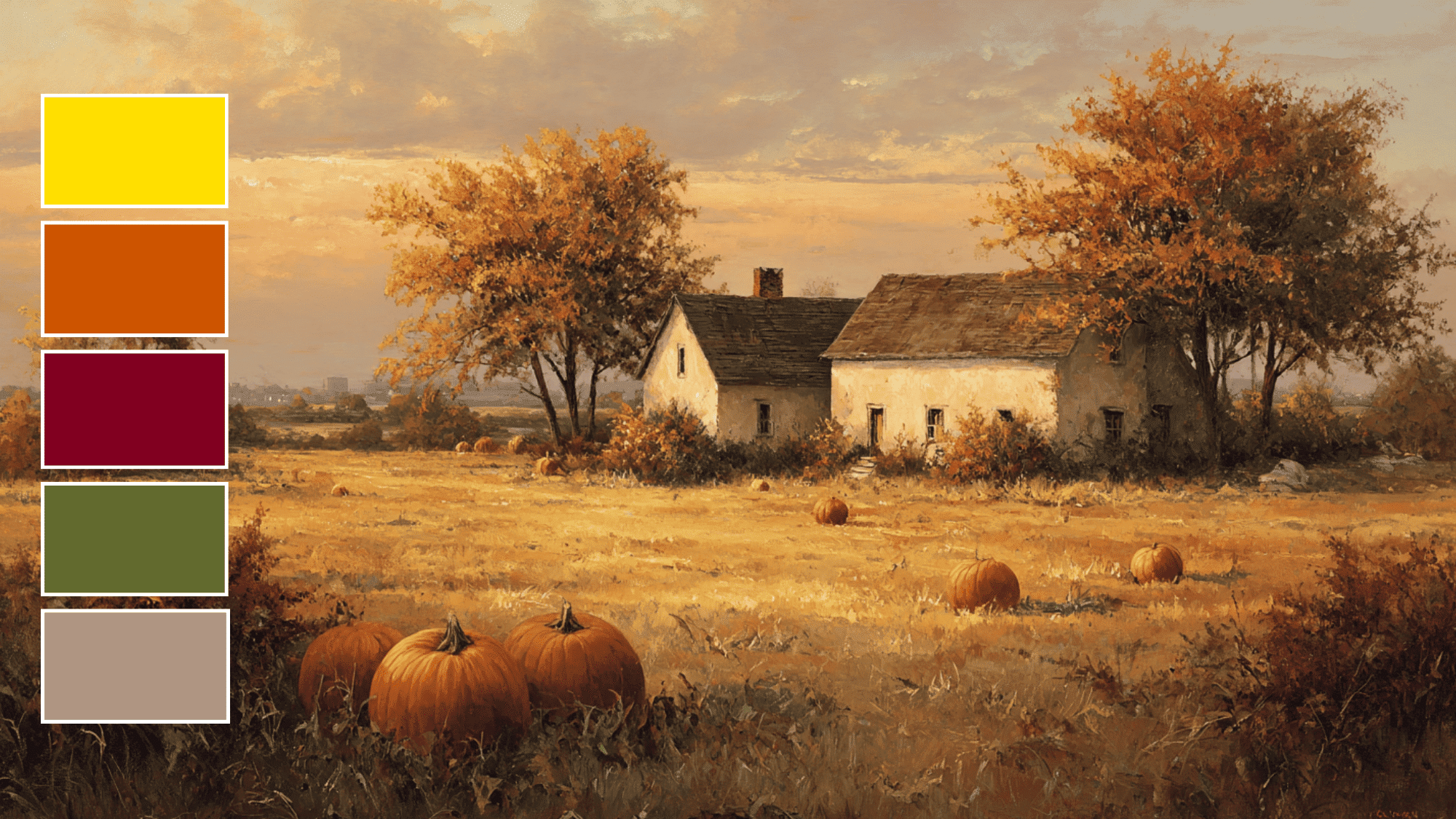
The Golden Harvest palette brings together the warm tones of autumn leaves and the colors of a ripe harvest. Golden yellow, burnt orange, and deep burgundy mix with olive green and warm taupe to create a cozy and earthy look.
This palette works well for homes, fall decorations, or clothing that wants to capture the feeling of a calm autumn day. Its mix of warm and muted colors feels friendly and natural.
Color Palette: #FFDF00, #CC5500, #800020, #808000, #AF9483
Usage: Ideal for cozy interiors, seasonal branding, and fall fashion collections.
2. Crisp Orchard
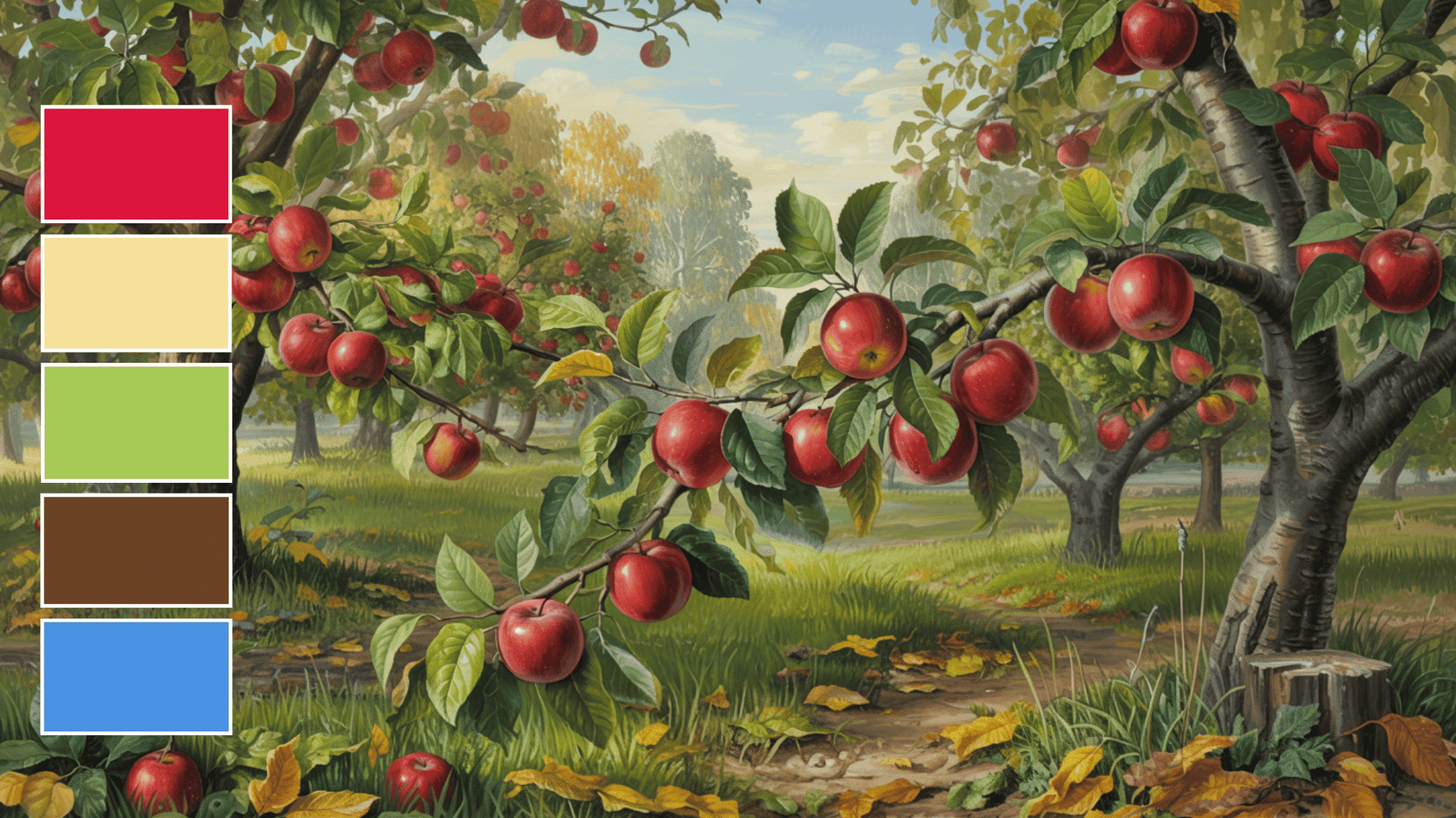
Crisp Orchard is full of bright, fresh colors that remind people of apple orchards in autumn. Crimson red, golden apple, and leaf green are balanced by earth brown and a soft sky blue, giving a cheerful but grounded look.
This palette is ideal for outdoor designs, fall-themed products, or fun seasonal outfits. The combination of fresh tones and soft accents creates a lively and inviting feel for any project.
Color Palette: #DC143C, #F2DC4A, #A7C957, #6B4226, #4A90E2
Usage: Perfect for outdoor event designs, product packaging, and children’s apparel.
3. Forest Retreat
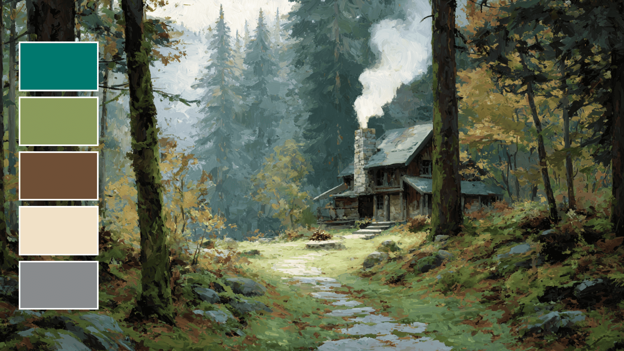
Forest Retreat is inspired by the quiet colors of a forest cabin. Pine green, moss green, and bark brown mix with cream and stone gray to create a peaceful, earthy feel.
This palette works well for rustic weddings, nature-inspired branding, or home decor with warm, natural tones. The colors are calm and grounding, making spaces or designs feel connected to nature.
Color Palette: #01796F, #8A9A5B, #6F4F37, #F1E1C6, #888C8D
Usage: Great for rustic wedding themes, nature-inspired branding, and home decor.
4. Autumn Spice
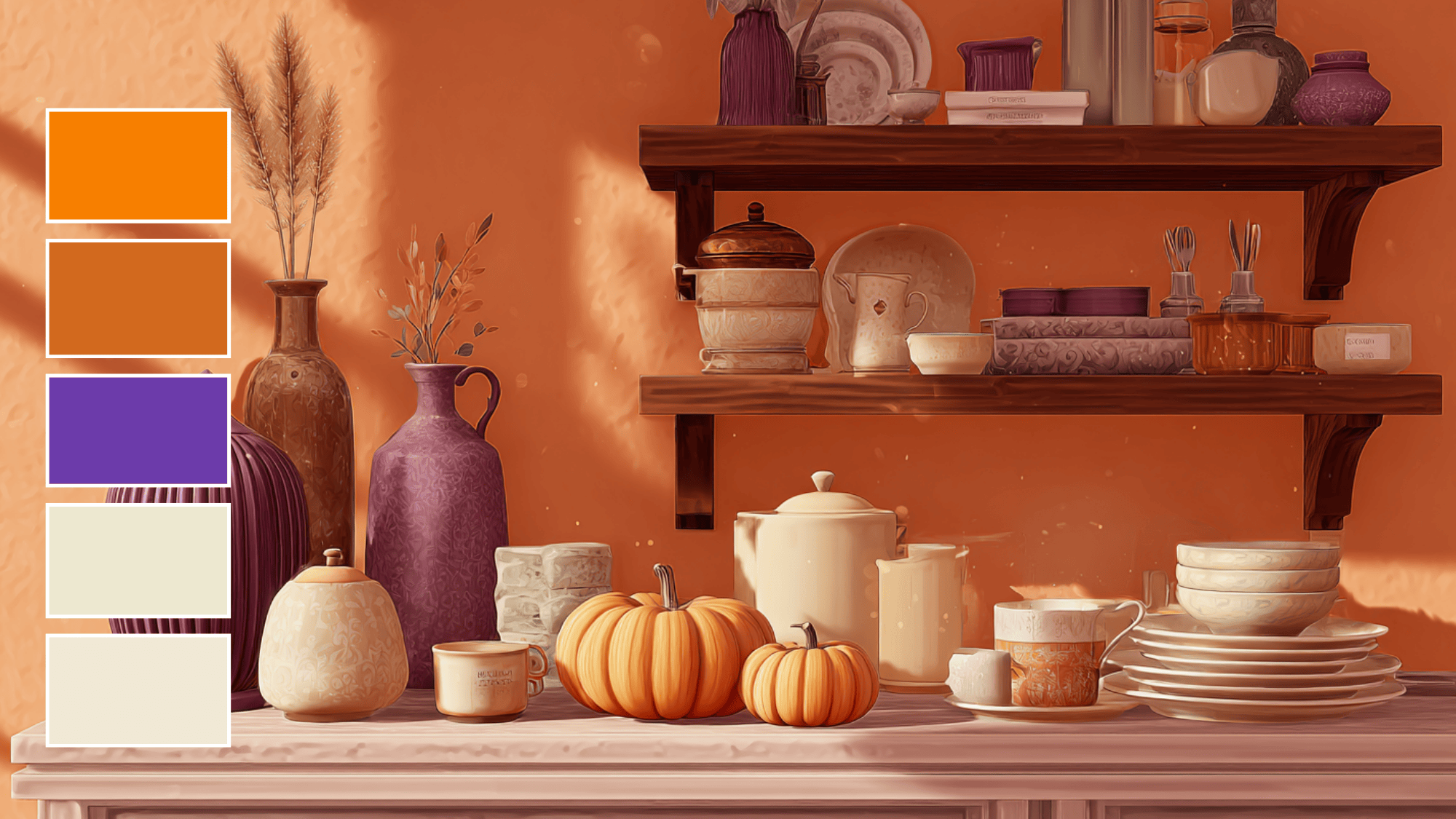
Autumn Spice brings together warm, cozy colors that evoke fall flavors. Pumpkin orange, cinnamon brown, and clove purple are paired with nutmeg beige and creamy white for balance.
This palette works well for seasonal marketing, cozy textiles, or autumn-themed events. The mix of warm and muted tones gives a friendly and inviting look that feels both lively and comforting.
Color Palette: #FF7518, #D2691E, #6C3BAA, #EDE8D0, #F0E9D6
Usage: Ideal for seasonal marketing campaigns, cozy textiles, and autumn-themed events.
5. Twilight Ember
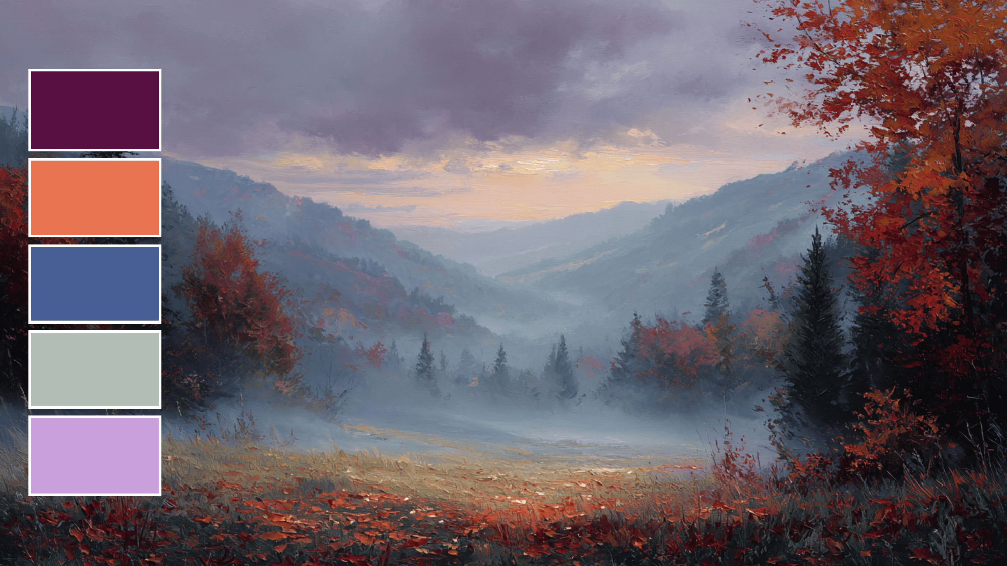
Twilight Ember captures the mood of a fall evening sky. Deep plum, burnt sienna, and dusky blue blend with ash gray and soft lavender for a calm, mysterious look.
This palette is great for evening events, fashion, or stylish designs that need a touch of quiet drama. The combination of dark and soft colors creates a scene that is both cozy and thoughtful.
Color Palette: #580F41, #E97451, #475F94, #B4B8B1, #C9A0DC
Usage: Perfect for evening events, fashion collections, and refined branding.
6. Verdant Grove
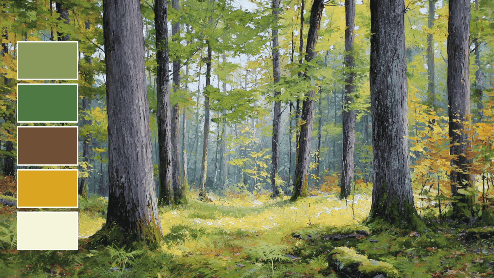
Verdant Grove draws inspiration from a peaceful forest. Moss green, fern green, and bark brown are balanced by goldenrod and soft beige to create a calm, earthy feel.
This palette works well for eco-friendly branding, nature-themed packaging, or cozy interior designs. Its combination of deep greens and soft neutrals brings a sense of freshness and tranquility to any project.
Color Palette: #8A9A5B, #4F7942, #6F4F37, #DAA520, #F5F5DC
Usage: Ideal for nature-inspired branding, eco-friendly product packaging, and tranquil interior designs.
7. Harvest Dawn
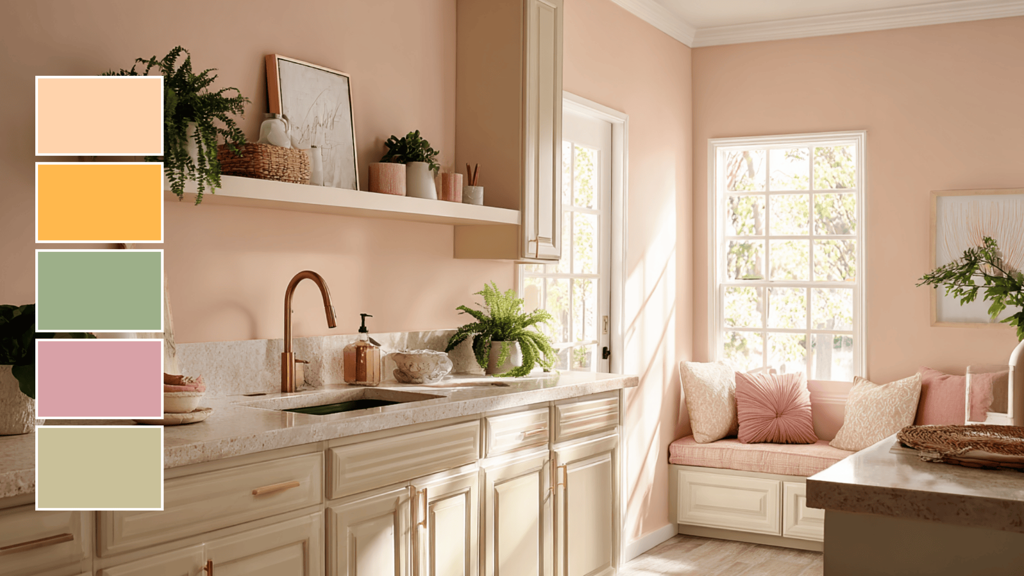
Harvest Dawn brings together soft, warm colors like soft peach and pastel orange, creating a fresh, inviting, and peaceful atmosphere that feels cozy and calming.
Sage green and dusty rose add a calming touch, while light taupe balances the palette with a neutral tone. This color scheme works well in kitchens or dining areas, offering a cozy, welcoming feel that’s perfect for autumn.
Color Palette: #FFD3AC, #FFB84D, #B2AC88, #D8A1A7, #B38B6D
Usage: Perfect for creating a fresh, uplifting vibe in kitchens, dining areas, and for seasonal decorations.
Fall Color Palettes for Different Design Projects
Creating the right look for your fall-themed project can be fun and easy with the right color palette. Below are a few ideas for using autumn colors across different design areas.
These examples can help inspire you to make your projects feel cozy and seasonal.
1. Rustic Wedding Invitations
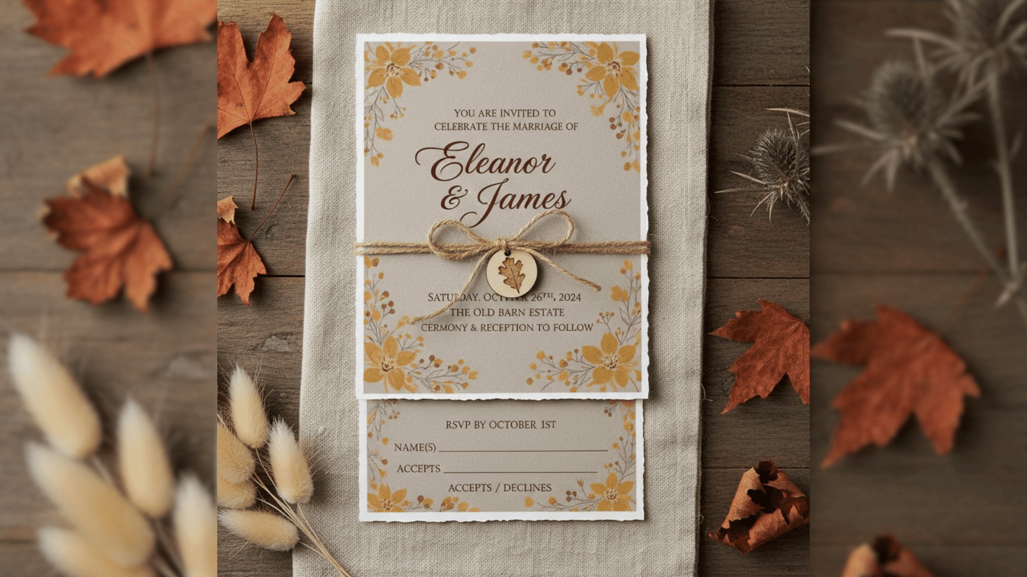
Soft taupes, mustard yellow, and deep maroon create a natural, earthy look perfect for rustic weddings. These colors remind us of autumn leaves and harvest time.
Taupe can be used for the main background, while mustard yellow and deep maroon work well for text and small details. This combination will make wedding invites feel cozy and welcoming.
2. Autumn Branding for Small Businesses
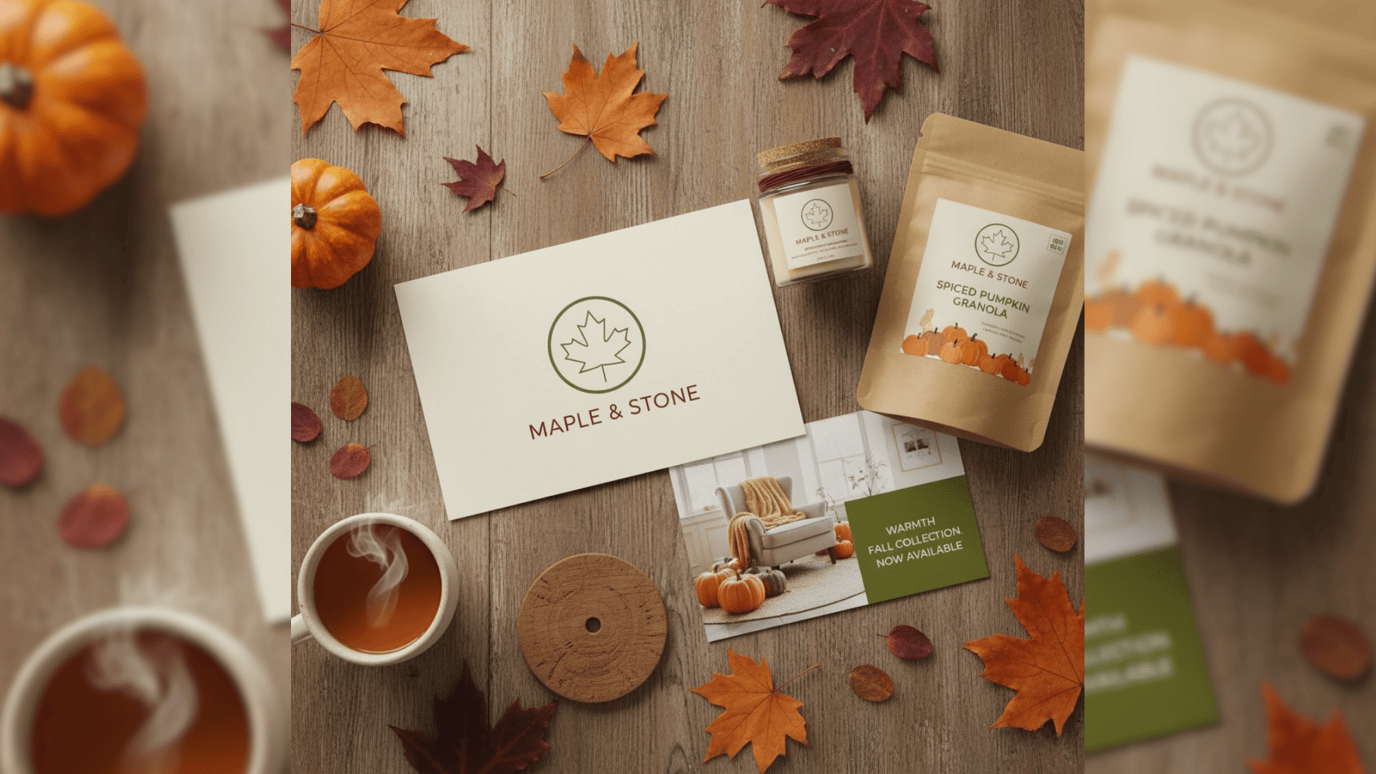
Rich oranges, burgundies, and olive greens are great for fall branding. These colors give a warm, inviting feel that fits with the season.
Use orange for buttons or promotions, burgundy for text, and olive green for logos or product packaging. This color mix will make your brand feel seasonal and approachable to customers during autumn.
3. Cozy Autumn Website Design
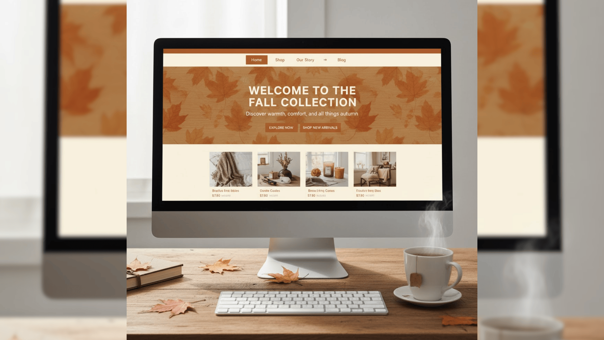
For websites, burnt orange works well for buttons and headlines, while cream makes text easy to read. The warm orange grabs attention, while cream helps balance the look and keeps it readable.
You can also add textured backgrounds, such as wood or leaves, to match the fall vibe, creating a warm, seasonal atmosphere. This color combo will make your site feel friendly, welcoming, and easy to use.
How to Use Fall Color Palettes in Interior Design
Fall colors can make a home feel warm and inviting. Using autumn tones in different rooms can bring a natural, cozy feel to your living space. Here are some ideas for key rooms in the home:
1. Living Rooms
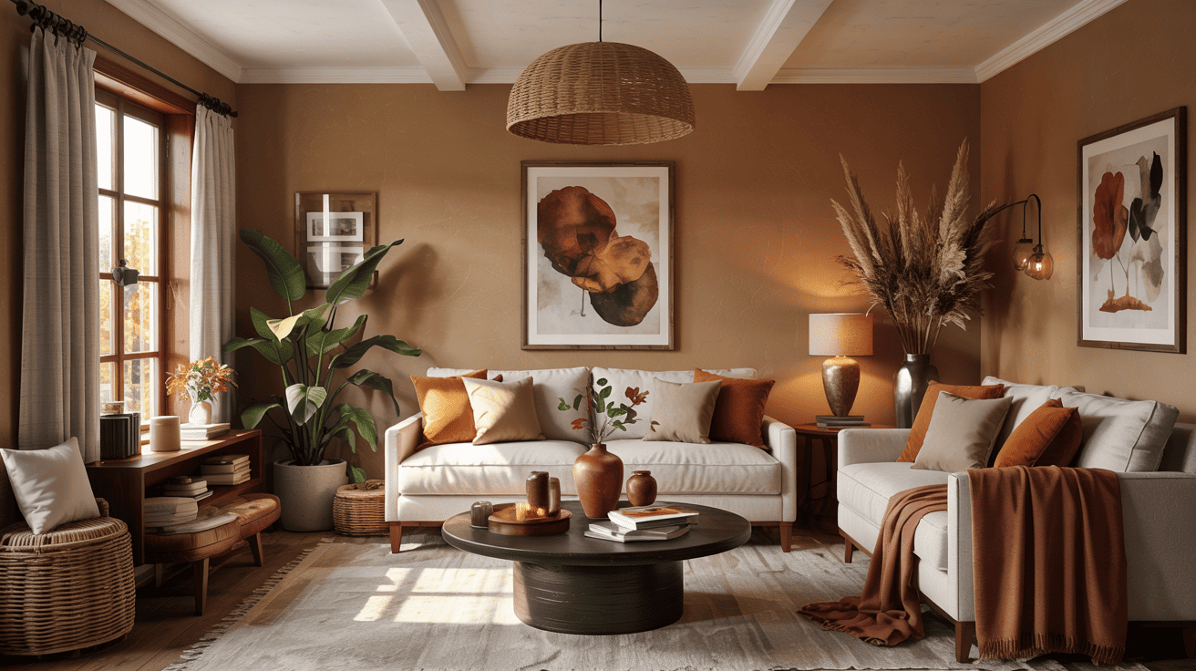
For living rooms, use warm fall tones on walls, furniture, or textiles. Ochre or burnt orange walls pair well with walnut furniture and cream-colored rugs.
Add terracotta vases, throw pillows, or blankets to bring depth and color to the space. Mixing dark greens and browns with lighter accents can create a cozy atmosphere where family and friends feel relaxed.
2. Kitchens
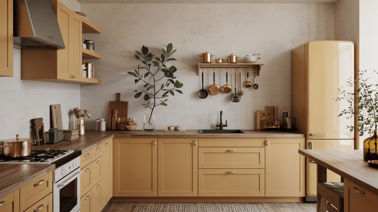
Autumn colors can make kitchens feel bright and welcoming. Consider using mustard or golden tones for cabinets, or add rust-colored accessories, such as dishware and kitchen towels. Wooden countertops and copper cookware complement these shades.
Small touches, such as amber glass jars, leafy centerpieces, or warm-toned rugs, can make the kitchen feel connected to the season without overwhelming the space.
3. Bedrooms
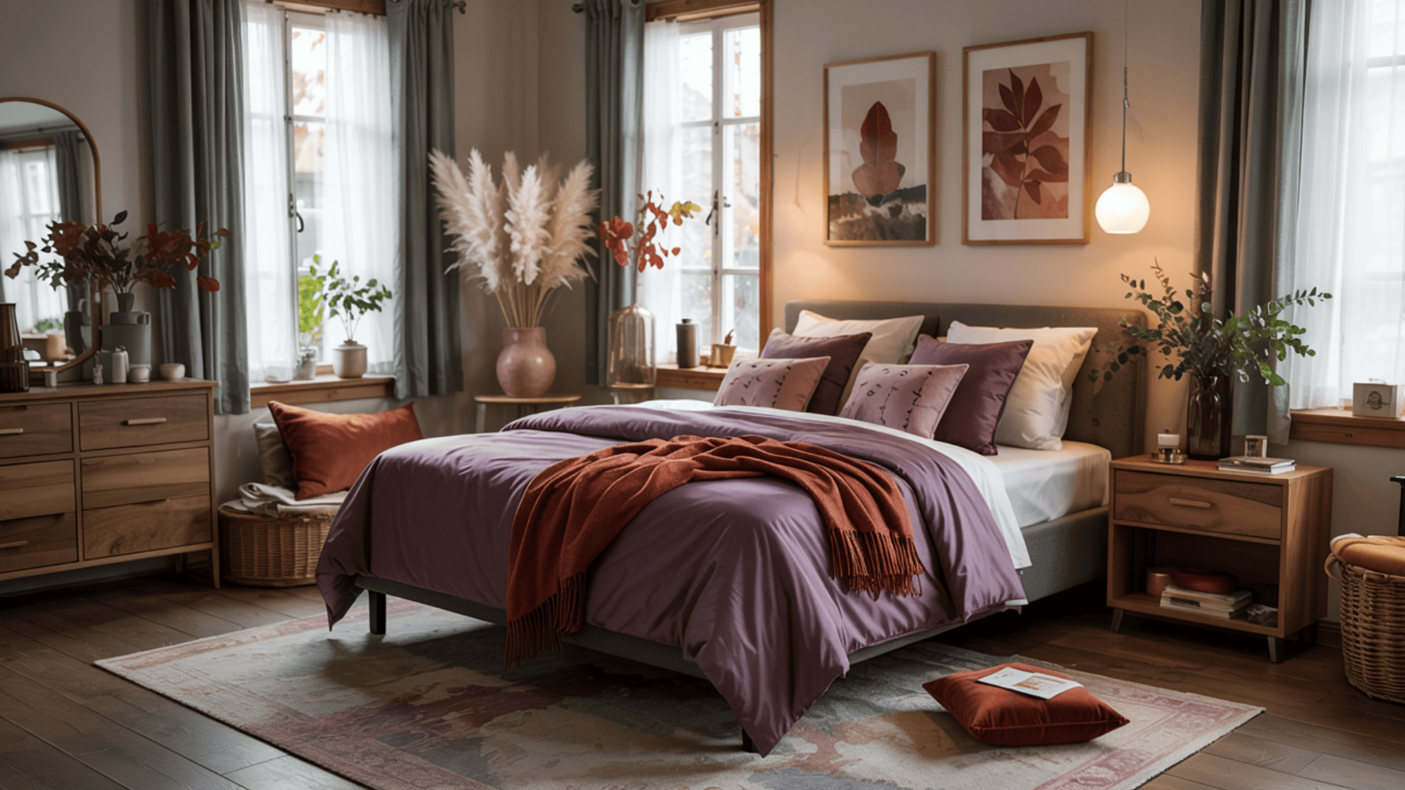
Bedrooms benefit from calm and comforting fall colors. Deep plum, soft lavender, or moss green on bedding or curtains can create a restful environment.
Walnut or oak furniture adds warmth, while terracotta or ochre decorative items bring gentle pops of color. Layering blankets and cushions in warm tones makes the room inviting and balanced, ideal for relaxing.
How to Choose the Perfect Fall Color Scheme
Picking the right fall color scheme can make your space or project feel cozy and balanced. Autumn colors include warm reds, oranges, yellows, as well as soft greens, purples, and neutral browns.
- Think About the Mood: Warm colors feel cozy, cool colors feel calm.
- Pick a Main Color: Start with one strong color to guide the palette.
- Add Supporting Shades: Use a few accent colors to match or contrast.
- Try Colors in Small Areas First: Test them with accessories or small walls.
- Balance Bright and Soft Tones: Mix bold colors with neutrals for balance.
Following these steps can help you create a fall color scheme that looks natural and feels comfortable and inviting. Even small touches of autumn colors can make a big difference in any space or design.
Psychological Impact of Autumn Colors: Mood and Emotion
The research study, Autumn Landscape Therapy Study, highlights that autumn colors significantly benefit emotional well-being. It found that virtual landscapes with vivid autumnal hues foster a stronger therapeutic effect, helping reduce stress and promote relaxation.
The study further indicates that integrating various sensory stimuli, such as visual and auditory cues, enhances these benefits, making virtual natural environments more effective for mental recovery.
This evidence supports the idea that warm colors, such as deep red, orange, and yellow, trigger positive emotional responses, fostering feelings of warmth, comfort, and nostalgia.
That’s a Wrap
A fall color palette offers limitless ways to add seasonal warmth to your life. From home design to fashion choices, these autumn shades create cozy, welcoming environments that celebrate the beauty of the season.
The colors you choose can affect your mood and make spaces feel more comfortable and connected to nature.
Start small with accessories or go bold with a full-room makeover – either way, fall colors bring positive energy and style. What’s your favorite autumn shade?
Share your thoughts in the comments below and inspire others with your fall color ideas!