Have you ever walked into a room and immediately felt your shoulders drop away from your ears, tension melting like ice cream on a summer sidewalk? Or perhaps stepped into a space that instantly energized you, making you stand a little taller and think a little clearer? If so, you’ve experienced firsthand the almost magical connection between color and emotion—a relationship that goes far deeper than simple aesthetic preference.
Colors aren’t limited to decorative roles like matching furniture or artwork—they hold psychological power that can significantly shape our emotions in a room. Nobody understands this color-mood connection quite like interior design expert Hayley Servatius, who has built a reputation for creating environments that not only look beautiful but also actively support emotional wellbeing through thoughtful color selection.
Ready to discover how the hues surrounding you might be secretly pulling your emotional strings? Let’s dive into the fascinating world where psychology meets design, and learn how to harness the mood-altering potential of color in your own spaces!
Blues and Greens Whisper Tranquility
When life feels like it’s moving at warp speed—deadlines looming, notifications pinging, responsibilities multiplying—creating a home environment that counterbalances that chaos becomes absolutely essential. This is where blues and greens shine brightest in the design toolkit, serving as visual antidotes to our often overwhelming modern existence.
Cool-toned blues evoke the serenity of clear skies and calm waters. Deep navy blues bring sophistication with their calming properties, and lighter azure tones create an expansive feeling reminiscent of gazing at an endless horizon.
Greens connect us instantly with nature, triggering our innate biophilia—that hardwired human affinity for natural environments. Soft sage greens promote restful sleep in bedrooms, with deeper emerald tones adding a grounding yet refreshing atmosphere.
Imagine transforming your bedroom with walls painted in a soft blue-green that mimics the ocean on a clear day, complemented by natural wood tones and crisp white linens.
Reds and Oranges Ignite Energy
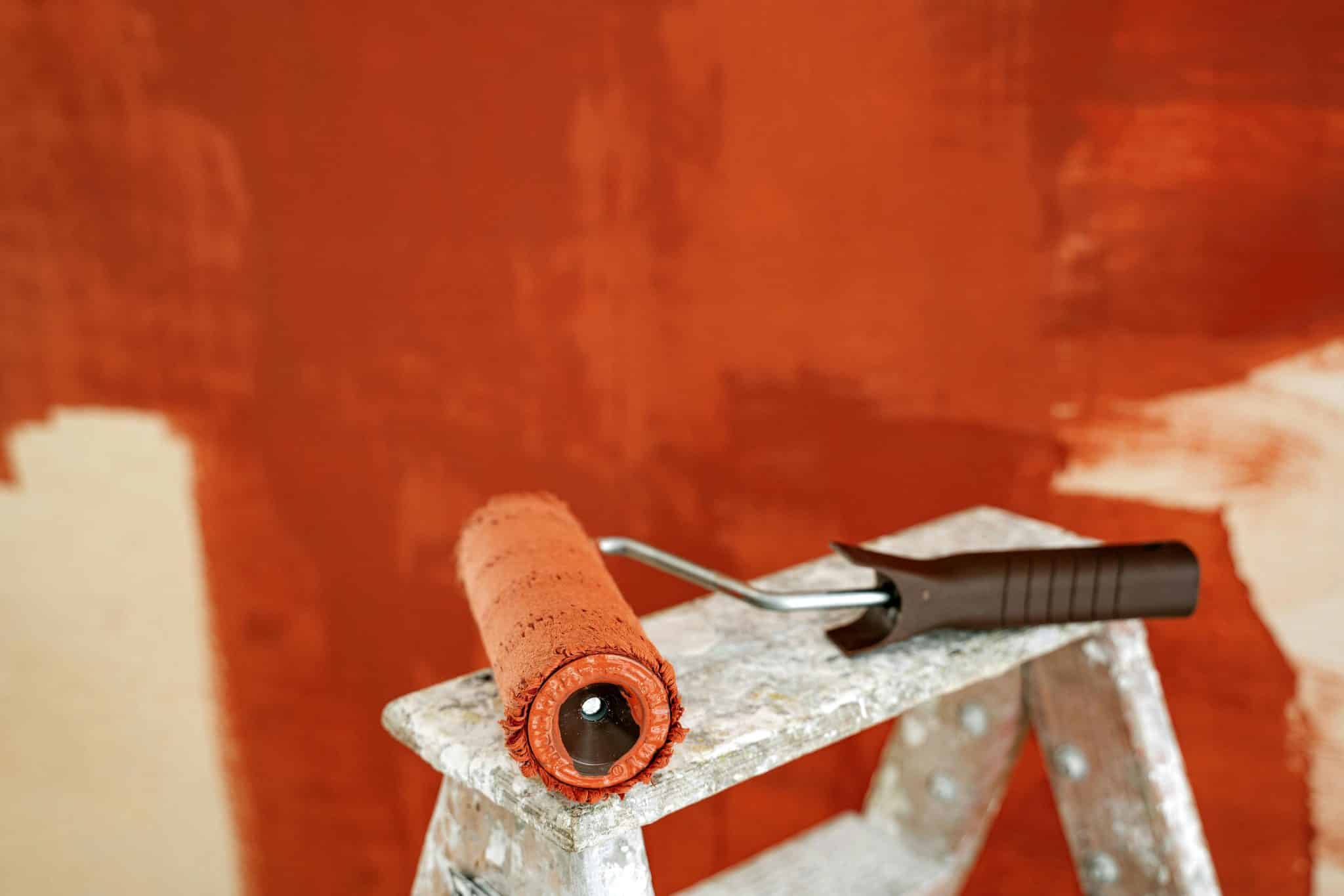
Some spaces in our homes aren’t meant for unwinding—they’re stages for conversation, creativity, and connection. Enter the warm side of the color wheel: the reds and oranges that Hayley Servatius strategically employs to energize spaces where active engagement takes priority over relaxation.
Red, the color of blood pumping through our veins, automatically triggers alertness. It physically speeds up our heart rate and heightens our awareness—which explains why it features prominently in dining rooms where conversation and appetite benefit from that extra energy boost. However, pure red can quickly overwhelm, which is why experienced designers often opt for sophisticated variations like terracotta, burgundy, or russet that deliver energy without agitation.
Orange combines red’s stimulation with yellow’s optimism, creating spaces that feel simultaneously warm and uplifting. Consider how a rust-orange accent wall might transform your home office from a place of mundane productivity to a creativity hub that actually stimulates innovative thinking. Or how coral-toned decorative elements might make your dining area feel more convivial, encouraging lingering conversations long after plates are cleared.
Neutrals Create Psychological Space
Vivid colors receive much attention for their mood-altering properties, but Hayley Servatius understands that neutrals play an equally crucial role in emotional wellbeing within our homes. These understated hues create psychological breathing room—mental white space that allows our often-overstimulated brains to process and reset.
“Your home needs to feel easy to live in, even when it’s fully styled. The balance between beauty and function is everything,” she says. This philosophy extends beautifully to color selection, where neutrals provide essential balance to more emotionally charged hues.
Contrary to popular perception, neutrals aren’t emotionally flat—they’re surprisingly sophisticated mood regulators. Warm neutrals like taupe, camel, and ivory create nurturing, grounded environments; cooler neutrals like gray and greige offer a contemporary serenity through their understated presence.
True design wisdom reveals itself in how neutrals are deployed—not as an absence of color but as intentional breathing space that prevents visual overwhelm. Neutral surroundings help colorful pieces stand out, creating clear focal points that harness emotional energy instead of dispersing it among too many distractions.
Visualize a greige living room where careful simplicity allows a striking emerald velvet chair to serve as the room’s emotional and visual heart. The neutrals aren’t boring—they’re performing the essential function of creating contrast that allows the emotionally potent green to work its psychological magic without overwhelming the space.
Yellow and Purple Transform Through Complexity
Some colors defy simple emotional categorization, affecting us differently depending on shade, saturation, and context. Hayley Servatius demonstrates particular skill with these emotionally complex hues—especially yellows and purples that can dramatically transform spaces through their psychological ambiguity.
Yellow contains perhaps the widest emotional range of any color—from anxiety-producing acid tones to the deep comfort of buttery, amber hues. Bright yellows stimulate mental activity and optimism but can quickly become overwhelming in large doses. Meanwhile, mustard and ochre yellows create rich, intellectual environments that feel simultaneously stimulating and sophisticated.
Purples blend the energy of red with the tranquility of blue, creating spaces with fascinating emotional complexity. Lavender offers soft tranquility and a touch of joy, complemented by deeper aubergine and plum tones that bring contemplative luxury. These dual-natured purples are perfect for spaces that serve multiple emotional purposes—such as a living room that energizes daytime gatherings and soothes during evening relaxation.
Consider how a library painted in a complex purple-gray might stimulate intellectual curiosity and at the same time encourage the contemplative focus needed for deep reading. Or how a sunshine yellow kitchen might energize morning routines and then shift to feel warmer and more nurturing as afternoon sunlight changes its look.
The fascinating relationship between color and emotion goes way past simple preferences or trends—it taps into fundamental human psychology that transcends time and culture. Inspired by Hayley Servatius’ careful color choices, we can design spaces that nurture our emotional wellbeing and avoid undermining it.
Next time you’re thinking about a new paint color or decor scheme, take a moment to consider not just how it will look, but how it might make you feel every day. Will that bedroom blue help quiet your racing thoughts at night? Will that dining room red stimulate the connection and conversation you hope to cultivate.